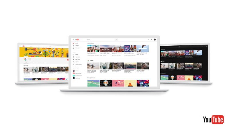
Apps need a makeover from time to time to look fresh, and YouTube is no different. With millions, or perhaps even billions of users using YouTube every single day, you can be sure that anything which makes YouTube easier and better to use would be more than welcome. The folks over at YouTube have begun to work on a redesign of the YouTube desktop experience which will highlight your favorite videos and creators -- all the while ensuring YouTube is easier to use while injecting additional fun into the experience. In fact, a preview of YouTube has opened up to a rather fortunate and select group of people from all over the world, in an attempt to obtain feedback so that the upcoming version of YouTube will be refined all the more through constructive feedback and criticism.
Material Design is the keyword here, where it will be applied to YouTube in an attempt to deliver a beautiful, delightful and intuitive user experience. Among the key principles of Material Design incorporated into the upcoming version of YouTube would be simplicity. In other words, the only thing that one should be concerned about ought to be enjoying the content that you love to watch. With a clean and fresh new design after removing distracting visuals from your browsing or watching experience, content is set to take off in a big way.
Apart from that, consistency is another point that the new design will concentrate a whole lot on. The new design will be aligned across major Google platforms, and this will also include the YouTube mobile app, without compromising on functionality since the feature that you have come to know and love will be part of the deal.
Of course, what is the whole point of making everything work better if aesthetics are not taken into consideration? The team at YouTube would like to increase the satisfaction of using YouTube while offering the features that its users have come to know and love. The merging of beauty and purpose will result in an effortless experience that anyone, regardless of which country the user is from. The entire YouTube site will be built on a new, faster framework which is known as Polymer, allowing quicker feature development right from the get go. One of the first new features that were developed using Polymer is called Dark Theme. Dark Theme is special, since it will help to cut down on glare so that the viewer will have the chance to enjoy the colors of the videos in a more vibrant manner.
With Dark Theme, it will transform your background dark throughout the whole YouTube experience. It is not the end, but just the beginning, since Polymer is well poised to deliver additional and more powerful features in the near future. Those who would like to give YouTube’s new look a go can do so by opting-in to preview the new design at youtube.com/new. Alternatively, you are able to make a quick return to the existing design by selecting “Restore classic YouTube” from the Account Menu. Have you given it a go just yet, and how did you find your experience so far?


